Who wants to increase customer loyalty by 22%? That’s a 22% longer increase in customer lifetime value. 22% more repeat purchases, 22% less churn. Sounds good, right? If you’re using CES, moving clients who answer 1 on their survey response to a 7 has been found to increase customer loyalty by at least that much.
CES or Customer Effort Score asks the customer how easy it was to resolve their issue on a scale from 1 (very difficult) to 7 (very easy).
So how do you make that jump? Follow along as we go through a month of CES-driven support improvements and see how you can get the most out of your survey responses. If you’re not using CES yet, you’ll still find a few useful ideas! First up, analyze the dataDon’t stress, if you don’t like analytics, we’re going to keep this simple. (It also gets much faster the second month on.) At the beginning of the month, you need to pull all the scores you’ve received with a score of 5 or less. These are the low scores you want to focus your attention on to get the biggest increase in customer loyalty.
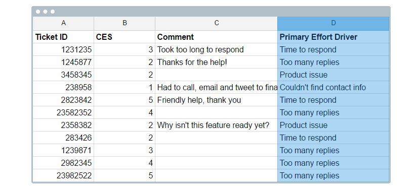
- Export the scores and their comments into a CSV or Excel spreadsheet. We want to match up the scores with the ticket IDs so we can go back and read the full conversation.
- If you tag tickets or use customer fields , or other fields, to group your tickets (by product, reason for contact, etc.); export that list too. Add it as a new sheet to your Excel or Google Sheets workbook.
- We perform a VLOOKUP using your ticket ID as the unique identifier to join the two lists together. Check one these VLOOKUP guides: G1 or G2. It’s a bit tricky but worth it!
- Add a new column called “Primary Effort Driver.” In this column, we want to detail the main reason why the customer found it too difficult to resolve the issue. We keep this list small, so it’s easy to bucket the primary drivers together (examples of effort drivers: bugs, couldn’t find the contact info, long responses, too many replies). You might already be tracking this in your ticket system custom fields.

- If you’re really interested in diving in, add a new column for primary product area that drove the interaction (i.e., Account Management, Shipping, Reporting, etc.).

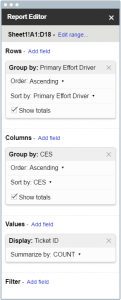
- And now it’s time for charts so we can see what’s really happening! Create a Pivot Table with the number of times a driver was responsible for each survey response. We need to highlight all the data on our joined sheet, choose Create Pivot Table (Or Data > Pivot Table in Google Sheets) and then choose our indexes. See the image below for an example. Remember, we’re just taking the lowest scores to look for improvements (so you’ll only see 1-5, instead of the full 1-7 scale).

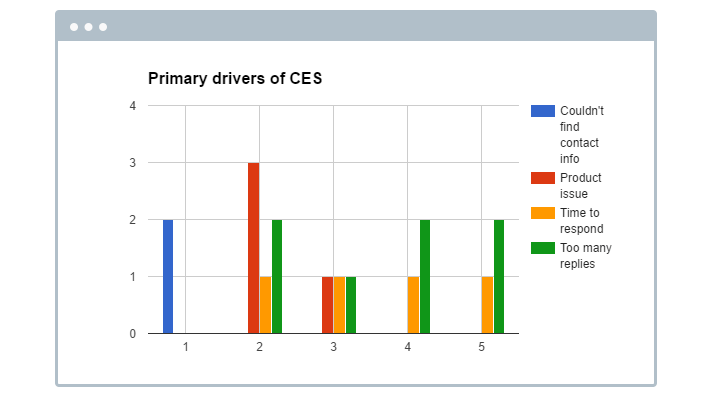
- Finally, create a bar graph from the information. The graph should give you something like the following chart which shows which drivers are causing the lowest scores.

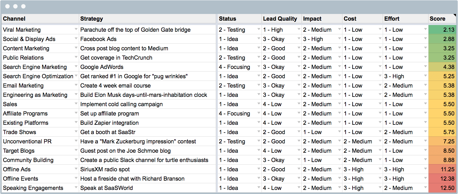
You can make pivot tables for any segment you like: agent, product type, custom fields, etc.! Determine the low hanging fruitAfter looking at the data, we can probably come up with 100 different tactics to target the concerns of customers experiencing high effort experiences. How can we possibly implement all of them? We can’t – we need to be smart about it. To prioritize improvements, we borrow a page from Baremetric’s marketing playbook. At any one time, they may have 100 items on their to-do list … but they will never get to all of them. Instead, they rank their ideas by effort and impact to determine where they can make the biggest difference with the least amount of effort. We’ve got a master list of ideas to target the biggest concerns our customers are talking about. In order to determine which one we work on next, we:
- Rank each idea on an effort score of 1-3 where 1 is very difficult and 3 is very easy.
- Rank each idea on an impact score where 1 is minimal impact and 3 is maximum.
- Add the columns together, then sort by total score. The top ideas are the ones that are both easy and impactful. Choose to work on these first.
Execute: Increase customer loyaltyAll right, once you’ve identified your best ideas (easy and impactful), you’ll need to put them into action. Working with the wider organization, commit to executing 2 or 3 ideas a month. Here are some suggestions for the types of projects you might embark on: Problem: Difficult to navigate Help Center
- Add a search extension like Algolia to your Knowledge Base to improve searching
- Examine your Help Center Information Architecture to see if you can restructure your categories
- Add in keywords to articles to make them more easily discoverable
Problem: Difficult to find contact information
-
- Add an in-product help tool, like Drift, or Intercom’s chat widget.
- Update your homepage to feature a link to support more prominently.
- Avoid channel switching (moving customers between different forms of contacting you, like telling tweeters to call a phone number).
Problem: It takes too many replies to get a resolution
-
- Spend time training agents on how to recognize and resolve complex problem quickly
- Focus on “forward solving” the next problem customers are likely to run into, instead of quickly moving to the next ticket.
- Create an automation that forwards tickets with more than 4 replies to a more senior agent to be resolved.
Problem: Unresolved bugs or product issues
-
- Identify the top offending problem, pull the data and work with your UX or Product designer on fixing the issue.
Continue measuringHopefully, you’ve picked the right projects to work on, and the next month will show improvements for the drivers of effort you identified. By keeping the way you measure effort consistent, you’ll be able to demonstrate which areas your projects has had an impact on. However, remember! It’s a marathon, not a sprint. Keep improving month over month, and you’ll see solid returns on your customer loyalty growth.


